Best React Component Libraries To Use
-
 Jul 30, 2020
 - React JS

Are you working on a React application and want to choose the best React UI component libraries for it? It can be an easy task but also tedious and that is because of the popularity of React. One can find many options of UI frameworks when it comes to creating a great-looking user interface for the React-based project. And to make this choice easier for you and find the best React UI libraries out of the various options available in the web development market, in this blog we have curated a list of top React component libraries that can be used by the developers.
To learn about these React UI libraries, and understand the usage, functionalities, and user-friendliness, let’s go through this blog and pick the best one for your web development goals.
1. What is a React Component Library?
A React UI component library is a software system that can be used by React app development companies for creating applications. This library comes with ready-to-use components that help developers to accelerate the development of React applications. Some of the popular components of this library are buttons, tables, maps, charts, and colors.
Besides this, the components of this library can be used in many different tools for customizing the application development processes and creating a user-centric design of the application. Basically, developers use these React UI component libraries to create user interfaces that are hassle-free for both web and mobile applications. As per a survey by Statista in 2022, React was the second most used web app development framework and this was because of its libraries and features that enable the developers to create applications faster and with ease.
2. Top React Component Libraries to use
After leaving the entire development community in awe, Reactjs introduces a bunch of interesting React UI libraries worth getting acquainted with. And it is high time we React developers in India admit the fact that these React tools act as the true testament to its popularity. Let’s explore the best of all!
1. Material UI (MUI)
")
Material UI (MUI) is one of the most popular React UI component libraries that comes with various pre-built templates and advanced components. For instance, MUI comes with pre-built drop-down menus, For example, it includes pre-built sliders, drop-down menus, and navigational tools. And this helps in saving a lot of app development time. Besides, each custom React component here meets current standards of accessibility and is fully customizable.
MUI is a component library that comes with some advanced theming features. In addition to this, it enables the users to work with Google’s Material Design system and also allows them to customize the code of the system with the help of CSS utilities. And with the help of such tools, one can control the use of components and styling from the same place. These are the features that can also help in speeding up the web app development process.

Material UI is one of the most popular React component libraries with more than 85k starts and 29.3k forks on GitHub.
Key Features:
- Easy to customize and use even if you’re a beginner.
- Material-UI increases overall software development velocity and builds amazing user interfaces at speed.
- You can develop user interfaces using MUI even if you’re building from scratch.
- Developers can spend a lot of time on the logical layers of their software rather than wrangling with CSS-based interface elements.
- The documentation of MUI is excellent as it offers various community resources such as free templates and courses.
Example: The below code illustrates the basic example of the Button component of Material UI.
import * as React from 'react'; import Button from '@mui/material/Button'; import Stack from '@mui/material/Stack'; export default function ContainedButtons() { return ( <stack direction="row" spacing="{2}"> <button variant="contained">Contained</button> <button variant="contained" disabled=""> Disabled </button> <button variant="contained" href="#contained-buttons"> Link </button> </stack> ); } |
Output:

2. React Router

React Router is one react components library that has gained a lot of popularity and this is for the declarative programming model. This means when a developer create React app, it is the best idea to have elements and components together that can be helpful declaratively in the application. Besides, React Router is known as a wonderful collection of such custom components and all of them help the web developers to add some URLs to bookmarks. And when any developer wants to navigate React, he can use React Router as a perfect solution to solve numerous tasks.
Because of all these things, it is one of the most-preferred React UI libraries that offers an effortless option to take care of the single application page navigation system. In addition to this, the React library in it also offers seamless server-side rendering and screen-to-screen shift with the help of intense sustenance for a particular nesting.
Key Features:
- You can use multiple interfaces in a single application.
- It helps you to choose the best routers for the application or website that you are planning to build.
- It permits developers to create single-page web applications that navigate without refreshing the page
- It saves a lot of time because it can accelerate your web application and automatically change the URLs and layouts.
- It has a declarative programming structure which is useful when you’re building React-based apps using several ready to use components and elements that are ready to compose.
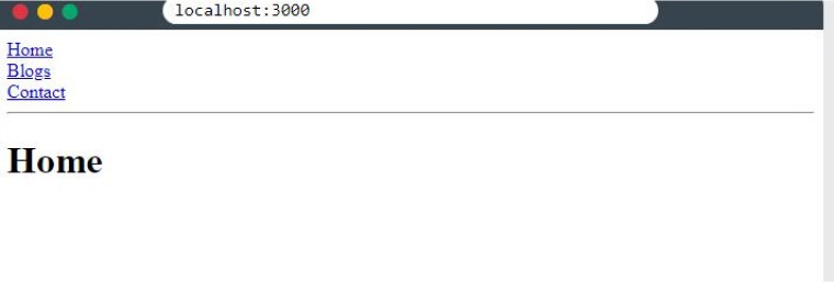
Example: Let’s see how the React Router library works.
import ReactDOM from "react-dom/client"; import { BrowserRouter, Routes, Route } from "react-router-dom"; import Layout from "./pages/Layout"; import Home from "./pages/Home"; import Blogs from "./pages/Blogs"; import Contact from "./pages/Contact"; import NoPage from "./pages/NoPage"; export default function App() { return ( <BrowserRouter> <Routes> <Route path="/" element={<Layout />}> <Route index element={<Home />} /> <Route path="blogs" element={<Blogs />} /> <Route path="contact" element={<Contact />} /> <Route path="*" element={<NoPage />} /> </Route> </Routes> </BrowserRouter> ); } const root = ReactDOM.createRoot(document.getElementById('root')); root.render(<App />); |
Output:
3. Blueprint UI

Blueprint is one such React UI library that has more than 40 React components that are optimized for complex data-dense interfaces for desktop applications. It is created by Palantir, a US-based tech company that specializes in big data analysis. This React component library is written in TypeScript and even the sample codes in their documentation are written in this language. The UI library supports web browsers like Firefox, Chrome, IE 11, Safari, and Microsoft Edge.

Blueprint UI is gaining so much popularity due to its features. It has 282 stars and 48 forks on GitHub. It also has huge community support on Stackoverflow. You can ask any question related to blueprint js if you are stuck while using this library.

Key Features:
- Blueprint allows developers to build heavy and feature-rich web applications easily.
- It is an effective tool that offers more than 25 standard components and 300+ modifiable icons, chooses time zones, and interacts with date and time.
- You’ll get unique light and dark mode themes with design elements to make your application stand out from the rest.
- If you’re using this tool then composer will allow you to perform compositing in real time and enhance your application’s user interface.
Offers useful features such as creating magic leaps, pixel streaming, chaos destruction, capturing mixed realities, and much more.
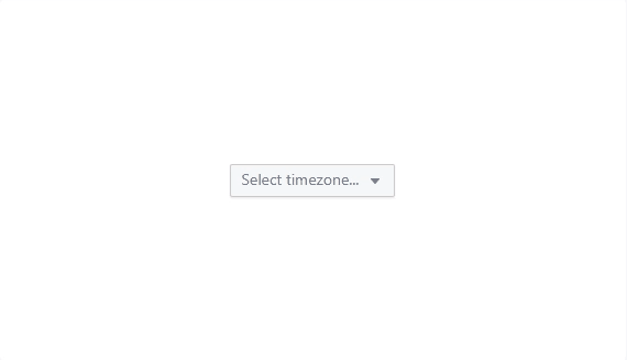
Example: Let’s see how the Timezone Picker component of Blueprint UI works.
import * as React from "react"; import { H5, Position, Radio, RadioGroup, Switch } from "@blueprintjs/core"; import { Example, ExampleProps, handleBooleanChange, handleValueChange } from "@blueprintjs/docs-theme"; import { TimezoneDisplayFormat, TimezonePicker } from "@blueprintjs/timezone"; import { CustomTimezonePickerTarget } from "./components"; export interface ITimezonePickerExampleState { disabled: boolean; showCustomTarget: boolean; showLocalTimezone: boolean; targetDisplayFormat: TimezoneDisplayFormat; timezone: string; } export class TimezonePickerExample extends React.PureComponent<ExampleProps, ITimezonePickerExampleState> { public state: ITimezonePickerExampleState = { disabled: false, showCustomTarget: false, showLocalTimezone: true, targetDisplayFormat: TimezoneDisplayFormat.COMPOSITE, timezone: "", }; private handleDisabledChange = handleBooleanChange(disabled => this.setState({ disabled })); private handleShowLocalChange = handleBooleanChange(showLocalTimezone => this.setState({ showLocalTimezone })); private handleCustomChildChange = handleBooleanChange(showCustomTarget => this.setState({ showCustomTarget })); private handleFormatChange = handleValueChange((targetDisplayFormat: TimezoneDisplayFormat) => this.setState({ targetDisplayFormat }), ); public render() { const { timezone, targetDisplayFormat, disabled, showCustomTarget, showLocalTimezone } = this.state; const options = ( <> <H5>Props</H5> <Switch checked={showLocalTimezone} label="Show local timezone" onChange={this.handleShowLocalChange} /> <Switch checked={disabled} label="Disabled" onChange={this.handleDisabledChange} /> <RadioGroup label="Display format" onChange={this.handleFormatChange} selectedValue={this.state.targetDisplayFormat} > <Radio label="Abbreviation" value={TimezoneDisplayFormat.ABBREVIATION} /> <Radio label="Composite" value={TimezoneDisplayFormat.COMPOSITE} /> <Radio label="Name" value={TimezoneDisplayFormat.NAME} /> <Radio label="Offset" value={TimezoneDisplayFormat.OFFSET} /> </RadioGroup> <H5>Example</H5> <Switch checked={showCustomTarget} label="Custom target" onChange={this.handleCustomChildChange} /> </> ); return ( <Example options={options} {...this.props}> <TimezonePicker value={timezone} onChange={this.handleTimezoneChange} valueDisplayFormat={targetDisplayFormat} popoverProps={{ position: Position.BOTTOM }} showLocalTimezone={showLocalTimezone} disabled={disabled} > {showCustomTarget ? this.renderCustomTarget() : undefined} </TimezonePicker> </Example> ); } private renderCustomTarget() { return <CustomTimezonePickerTarget timezone={this.state.timezone} />; } private handleTimezoneChange = (timezone: string) => this.setState({ timezone }); } |
Output:
4. React Spinner
React Spinners is a very popular React animation library that has a reasonable amount of loading spinners to frequently see on any React applications, websites, and nearly any software. It comes with more than 20 total loading spinners that have enhanced animation and draw cues from David’s collection from the Halogen React library. Besides this, React Spinners is a library that allows the web app developers to configure various types of properties of the library like the size, color, width, height, margin, and radius.
This clearly means that when a React developer experiments with different attributes, he can get quick access to various loading spinner variations. And to get this library, all you need to do is install it with the use of either NPM or yarn.
5. Fluent UI

Fluent UI is one of the most popular Microsoft products. It is a set of accessible UI components that are created by using Microsoft’s design language. This is a React based UI toolkit that offers compatibility with different platforms like Android, iOS, and Windows Desktop. Besides, it can also be used by sites like OneNote, Office 365, Azure DevOps, and various other Microsoft products. Fluent UI comes packed with various most popular React components that enable the developers to easily prototype the Mobile or desktop applications. Besides, it is a library that has 14k Github stars and is well supported by Microsoft.

Key Features:
- Every browser supports Fluent UI React.
- It is highly customizable.
- You can acquire prebuilt components that can be used to create most pieces of an application in the Microsoft Office design language.
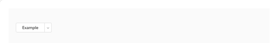
Example: Here’s an example of SplitButton Component of React Fluent UI.
import { Menu, MenuItem, MenuList, MenuPopover, MenuTrigger, SplitButton, MenuButtonProps, } from "@fluentui/react-components"; import * as React from "react"; export const Default = () => ( <menu positioning="below-end"> <menutrigger disablebuttonenhancement=""> {(triggerProps: MenuButtonProps) => ( <splitbutton menubutton="{triggerProps}">Example</splitbutton> )} </menutrigger> <menupopover> <menulist> <menuitem>Item a</menuitem> <menuitem>Item b</menuitem> </menulist> </menupopover> </menu> ); |
Output:
6. Chakra UI

Chakra UI is a React user interface component library that is used by more than 20k React projects on GitHub. It is a simple library that offers customizable components and modular React components to support web apps. The UI creation elements that come with this library are optimized for dark mode. Besides, it is a library that is fully compatible with accessibility standards like WAI-ARIA. Chakra UI library is built with around 97.5% of TypeScript, 1.9% of JavaScript, and another 0.6% of unspecified code.
React developers install Chakra UI to easily develop their design system or simply install some of its popularly used Chakra UI components. It is a library that entirely focuses on the application development process and offers a great user experience. Basically, though it is a relatively new React component library when compared to others, it is still popular amongst developers for creating small to medium-level projects.
Key Features:
- Chakra UI includes various layout components like stack and box that help you to style your components easily using properties
- This tool comes with a set of reusable and composable React components which can be used to build front-end apps.
- It supports dark mode.
- It follows WAI-ARIA rules in its components.
- You can easily compose new elements due to its easy-to-use navigation and user interface.
- It is developed on top of a React UI primitive for limitless composability.
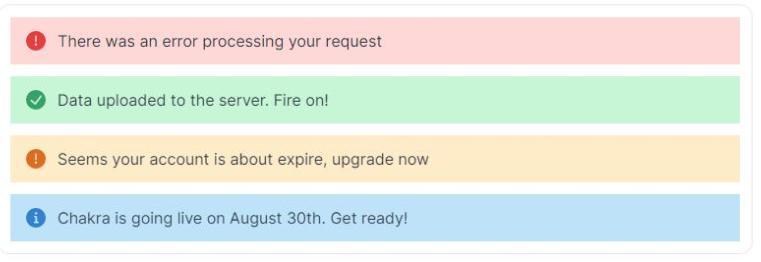
Example: Let’s see how the Alert component of Chakra UI is used in React Js.
<Stack spacing={3}> <Alert status='error'> <AlertIcon /> There was an error processing your request </Alert> <Alert status='success'> <AlertIcon /> Data uploaded to the server. Fire on! </Alert> <Alert status='warning'> <AlertIcon /> Seems your account is about expire, upgrade now </Alert> <Alert status='info'> <AlertIcon /> Chakra is going live on August 30th. Get ready! </Alert> </Stack> |
Output:
7. Hook
React Hooks is a minimalistic and popular react component library that works wonders without any dependencies. The hook is the new addition to React that unlocks useful features in classless styled-components or to write custom CSS. Gone are the days when React used lifecycle methods such as componentDidMount() to manage the state. This encourages separation of concerns because its components are not managing their own state. Here putting a lot of state management inside class components blows up complexity. React Hooks attempts to alleviate this problem by providing key features.
Some of its basic Hooks include:
- useState: For mutating state in a classless component without lifecycle methods
- useEffects: Mainly for executing functions post-render, useful for firing Ajax requests
- use Context: Mainly for switching component context data, even outside component props
Some of its major advantages are:
- Mitigates state management complexity
- Supports functional components
- Encourages separation of concerns
8. React Bootstrap

React Bootstrap is basically developed to control and use the React UI components. It has pre-built primitive react UI components for better compatibility. With React Bootstrap, user interface and experience gets a boost with Fluid like experience.
In addition to this, do you remember the old days of joy of using a bunch of compatible bootstrap themes? Bootstrap stylesheet surely brings the phase back. As a result, web developers can write code fast with the help of reusable pre-built React bootstrap components.
Key Features:
- React-Bootstrap is compatible with a wide variety of UIs that relies on Bootstrap stylesheet and works with more than one theme that you might like.
- You can easily access all the components so that the user can get better control over each component’s function.
- React bootstrap is lightweight and less time-consuming.
- You can minimize the code volume in your software just by importing the required components instead of importing the entire library.
Example: Here’s an example of React Bootstrap.
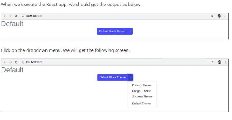
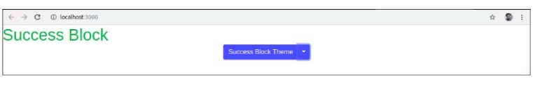
import React, { Component } from 'react'; import { SplitButton, Dropdown } from 'react-bootstrap'; class ThemeSwitcher extends Component { state = { theme: null } chooseTheme = (theme, evt) => { evt.preventDefault(); if (theme.toLowerCase() === 'reset') { theme = null } this.setState({ theme }); } render() { const { theme } = this.state; const themeClass = theme ? theme.toLowerCase() : 'default'; const parentContainerStyles = { position: 'absolute', height: '100%', width: '100%', display: 'table' }; const subContainerStyles = { position: 'relative', height: '100%', width: '100%', display: 'table-cell', }; return ( <div style={parentContainerStyles}> <div style={subContainerStyles}> <span className={`h1 center-block text-center text-${theme ? themeClass : 'muted'}`} style={{ marginBottom: 25 }}>{theme || 'Default'}</span> <div className="center-block text-center"> <SplitButton bsSize="large" bsStyle={themeClass} title={`${theme || 'Default Block'} Theme`}> <Dropdown.Item eventKey="Primary Block" onSelect={this.chooseTheme}>Primary Theme</Dropdown.Item> <Dropdown.Item eventKey="Danger Block" onSelect={this.chooseTheme}>Danger Theme</Dropdown.Item> <Dropdown.Item eventKey="Success Block" onSelect={this.chooseTheme}>Success Theme</Dropdown.Item> <Dropdown.Item divider /> <Dropdown.Item eventKey="Reset Block" onSelect={this.chooseTheme}>Default Theme</Dropdown.Item> </SplitButton> </div> </div> </div> ); } } export default ThemeSwitcher; |
Output:
Now, if we choose the Success Theme, we will get the below screen.
9. React Boilerplate

Are you looking for a developer-friendly React library that gives you the best foundation for scalable-looking React projects? React Boilerplate offers an offline first setup that delivers high performance. The best part here is that your application will be available from the moment your clients load the application, and here there is no network connection required.
Effectively working with Chrome Redux DevTools, and React Boilerplate successfully assists you in the creation and testing of components, containers, etc. from the CLI. With React Boilerplate the real-time changes that you have made can be seen immediately in CSS modules and JavaScript.
10. Ant Design

This is one of the popular React UI libraries that has enterprise-class features along with material UI design language. It may quite interest you to know that Ant Design is another most powerful material design system that assists several React development service providers well in creating better user experiences for enterprise applications.

With over 84k stars on GitHub, this best React component library in particular is extremely good at what it does. This React framework library has 50 high-quality ant design components written in Typescript. TAnt Design can be best used in alignment with the help of design resources and tools.
Ant Design is a UI react library and has features like Rebass which supports several programming languages and makes it easy to localize applications.
Key Features:
- Ant Design offers more than 50 prebuilt high-quality React components such as navigation, buttons, feedback, layouts, typography, and much more on your projects instead of creating them from scratch.
- It helps you to adjust every aspect of the theme of your choice.
- The latest version of Ant Design offers excellent features like a design toolkit and templates that will help you design your applications.
- You can use the design packages for data visualization, mobile, and graphic solutions.
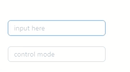
Example: Let’s see how the Autocomplete component of the Ant Design library works.
import { AutoComplete } from 'antd'; import React, { useState } from 'react'; const mockVal = (str: string, repeat = 1) => ({ value: str.repeat(repeat), }); const App: React.FC = () => { const [value, setValue] = useState(''); const [options, setOptions] = useState<{ value: string }[]>([]); const [anotherOptions, setAnotherOptions] = useState<{ value: string }[]>([]); const getPanelValue = (searchText: string) => !searchText ? [] : [mockVal(searchText), mockVal(searchText, 2), mockVal(searchText, 3)]; const onSelect = (data: string) => { console.log('onSelect', data); }; const onChange = (data: string) => { setValue(data); }; return ( <> <AutoComplete options={options} style={{ width: 200 }} onSelect={onSelect} onSearch={(text) => setOptions(getPanelValue(text))} placeholder="input here" /> <br /> <br /> <AutoComplete value={value} options={anotherOptions} style={{ width: 200 }} onSelect={onSelect} onSearch={(text) => setAnotherOptions(getPanelValue(text))} onChange={onChange} placeholder="control mode" /> </> ); }; export default App; |
Output:
11. React Virtualized

Building a frontend that’s data-heavy? React Virtualized best React UI framework library that you need to delve into. This includes a wide range of UI components leading to efficiently rendering large lists, tables, and grids. Let us know this better with the help of an example; you will find masonry, columns, authorizers, direction stories, window scroller, and way more. The best part here is you can customize the tables by simply configuring the row heights and displaying placeholders in the cells.
In addition, React Virtualized supports standard browsers such as recent mobile browsers for iOS and Android and has very few dependencies. Ths features make React Virtualized one of the best component libraries.
Key Features:
- React Virtualized has an efficient rendering that has the ability to render complex and large tabular and list data having thousands of elements.
- It offers a variety of components, including an auto-sizer, a multigrid, columnsizer, an arrowkeeper, direction sorters, a cellmeasurer, etc., apart from the common ones.
- It supports web browsers for iOS and Android.
- It allows you to customize your table by adjusting its row heights.
12. Semantic UI React

Semantic UI React is a component framework. It is Mainly built for theming and comprising 50 semantic UI elements with 3000+ CSS variables, it is based on useful principles from natural language, flexbox compatibility, and responsive design with 3 levels of variable inheritance.
With this semantic UI react components library, developers can use it very beautifully to develop websites with HTML and JavaScript.

With about 50k stars and 5.1 forks on Github, there is no shadow of a doubt that the semantic UI React library is very popular in the React community. In order to define bind components, JSX code can be used easily. This semantic UI React library has some more potential features like easy setup CSS, Components APIs, keyboard support, and is well documented and tested.
Key Features:
- Semantic UI allows developers to easily create responsive layouts.
- This tool has a set of effective and powerful tools for expressing groups and collections.
- Semantic UI has the ability to save drafts automatically while writing.
- It is capable of implementing cover pages on blog pages.
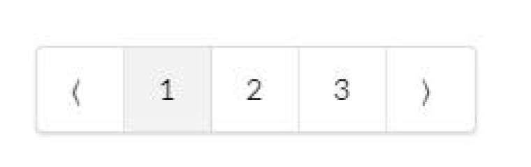
Example: Let’s see how pagination is used in the Semantic UI React library.
import React from 'react' import { Pagination } from 'semantic-ui-react' const PaginationExampleCompact = () => ( <Pagination boundaryRange={0} defaultActivePage={1} ellipsisItem={null} firstItem={null} lastItem={null} siblingRange={1} totalPages={10} /> ) export default PaginationExampleCompact |
Output:
3. Conclusion
Well, this is not just it! Many more best react component libraries and react tools are resulting in making React development such valuable technology for front-end development. The list is based on the use case for most of the applications. Feel free to comment if I missed anything on the list.
A lot can go wrong in the web development realm. For starters, you may find this list a bit exhaustive but at the same time...
Comments
-
Leave a message...


To be honest, I expected more from this blog but It didn't live up to my expectations. You did mention some common react libraries. There are so many other other popular react libraries that you can add to this blog. I hope you update this blog in the future. Thanks!
These are just a few of the many excellent React libraries available. Choosing the right libraries will depend on your specific needs and the requirements of your application. Thanks for sharing!
Pretty good article, check some good React.JS IDEs as well.
I love the post! Thanks for sharing these amazing react libraries.
React is becoming a trending topic. I think this is an informative post and it's very helpful and well-informed. I enjoyed reading this post so much.