Impact of using Shadows and Blur Effects in Modern UI Design
-
 Sep 7, 2017
 - UI UX Design
What is Modern User Interface design?
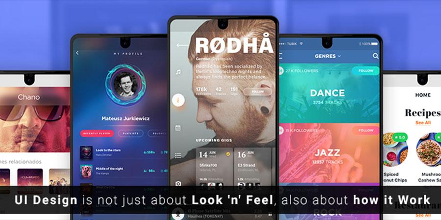
User interference is merely an interaction between the user and the application or device. This means it’s not just about how the product looks, rather about how it works. Focusing on the UI design on the early phase of development life cycle is pretty vital, as it is the core part of the complete app or web solution for users’ Look and Feel. General survey says that – Most of the users spend more than 3 hours online every day using a myriad of devices, so the design of web pages and mobile apps requires being exclusively attractive with an appropriate colour scheme to hold back viewers for a longer span.
For an effective and precise approach to create a fresh experience, UI Designer and UX Developer need to follow below mentioned 5 UI/UX principles:
1. Design should focus on an experienceViewers do not always remember information presented but they do remember how they felt while surfing through the website or using an app. Advertisers motto is to focus on selling to hearts then why don’t UI designers? UI/UX designs have become an integral part of the web and mobile application works. Thus, it has to be a perfect blend of text, graphics, layout and interactive elements to make sure that users have an experience like never before and not just an informational view.
2. Instead of reading, people scan websitesMost of the UI design companies aim to create a website that is more scannable because users don’t read the website as they read other material. No wonder why infographics have become standard fare for anyone looking to convey sets of data or instructions?
“Users switch from scanning to actual reading the copy when web content helps [them] focus on sections of interest.”
3. Crave for simplicity and clarityIt takes just 0.5 seconds for visitors to decide whether they are interested in a website or not. So, be clear what you want users to do. To stay and surf more or bounce back? Never make a user think about what you want them to do. For instance, focusing visual attention on one button v/s focusing on the Home page. Think wisely!
Moreover, consider what web app or website can do to make the UI design easy in terms of use. A consistent design is actually simple for the user because it reuses components, behaviors, colours and aesthetics to reduce the need for users to rethink.
4. Know where to get creative and where to use common design patternsBe very careful with innovating new UI patterns. After all, you don’t want people to think too hard about where common elements are. Most of the interfaces should be familiar to users such as links should look like links and not buttons.
In addition to this, Navigation, URLs, and button placement should focus on usability first before design aesthetic.
5. Build a nice responsive design rather than just responsive designDesigning a website or an app to have a fluid interface for varying devices sizes is becoming pretty popular these days. How responsive design makes a difference? There are a few key principles that are at its core.
Fluid grids – Grid system that scales based on user’s screen as opposed to fixed-width layouts that always appear the same.
Flexible images – Resizing the images is very challenging part in UI designing. With CSS’s max-width property, images load in their original size unless viewpoint is narrower than the image’s width.
Outcomes of having Responsive Design app/web:
- More mobile traffic
- Faster mobile development at lower cost
- Lower maintenance needs
- Faster web pages loading time
- Lower Bounce rates and high conversion rates
- Improved SEO
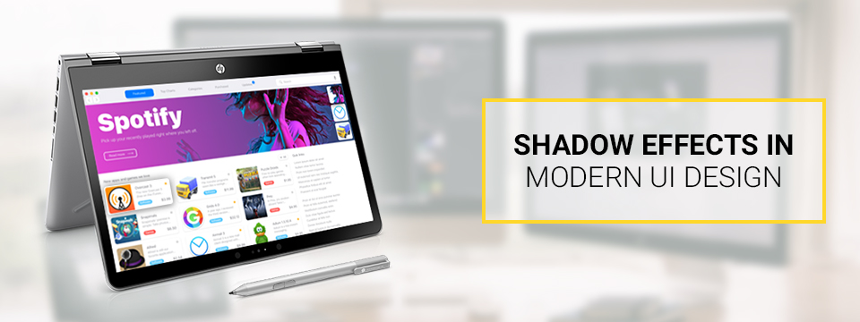
Shadows and User Interface Discoverability
The reason why most of the UI designers incorporate shadows into their designs is to create visual cues in the interface which tells human brains what user interface elements they are looking at.
- Design Affordance
The inception of Graphical User Interfaces is the screens have utilized shadows to help users on how to use an interface. Although visual cues vary from app to app, users can rely on two assumptions:
- Elements that appear raised look like they could be pressed down. The technique is often used as a visual signifier for buttons.
- Elements that appear sunken look like they could be filled. This technique is used as a visual signifier for input fields.
- Create a visual hierarchy and impression of depth
Modern interfaces are layered in UI design where shadows indicate the hierarchy of elements by differentiating between two objects. Also, in many cases, shadows help users to understand that one object is above another.
In fact, it is very important to visualize the position of an element within three-dimensional space. Why may you ask? Remember the law of physics –
“Everything in this physical world is dimensional and elements interact in three-dimensional space with each other. Moreover, they can be stacked or affixed to one another but cannot pass through each other. And objects can also cast shadows and reflect light. The understanding of these interactions can result by improving the graphical interface.”
- Provide visual feedback using elevation
The important thing to be taken into consideration about shadows is that they work in tandem with elevation. Elevation means nothing but the relative depth or distance between two surfaces. For example, the shadow gets bigger and blurrier the distance between object and ground increases.
Blur Effects
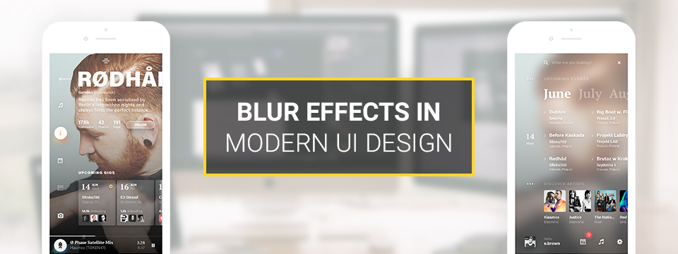
When Apple introduced iOS 8, it raised the bar for app design, especially when it came to on-screen effects. One of the most significant changes was the use of blur that occurs in an interactive fashion, as one controls it completely with the movement of fingers.
Follow the blur techniques for better UI design
- Make user flow obvious – Blur effects allow for a certain amount of play within layers and hierarchy of an interface especially for mobile apps. It is very efficient with layers as it gives the user a clear understanding of a mobile app’s user flow.
- Direct the user’s attention – Humans have a tendency to pay proper attention to objects that are in focus and ignore objects that aren’t. UI designers make use of the same concept to blur unimportant items on the screen just to direct user’s attention. The background is barely recognizable.
- Content-heavy pages – Blurred background can cause a problem when it is used for screens filled with lots and lots of content.
Ending Up
Though there are other UI design effects namely Gradient, Animation, Transition, Shadow, Stroke, Glow, Satin, Bevel, Emboss and much more, Shadows and Blur leaves an immense impact on users mind with meaningful attractive design resulting in improvement of functional aspects of design and leading to potential interaction between user and objects.
Free open source Content Management System, WordPress came up with a free plugin WooCommerce specially for developing an e-commerce based solution. Yes, the buzz of...

Comments
Leave a message...