Responsive and Mobile First Bootstrap Framework
-
 Feb 10, 2017
 - Responsive Design
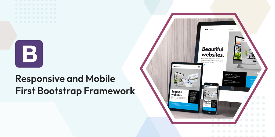
Bootstrap is a popular HTML, CSS framework for the development of responsive, mobile-first web projects.
Bootstrap is the most renowned CSS, HTML and JS framework to develop mobile first, responsive projects on the web. Responsive, mobile-friendly websites no longer are good-to-haves, they are now must-haves. With more and more people more than ever browsing the web, opening email and doing shopping on their mobile device, it is integral to have a mobile-first mindset. If a website is not optimized for mobile browsing and optimized, the bounce rates would grow and the ranking will drop.
BOOTSTRAP IS THE MOST POPULAR WAY OF BUILDING RESPONSIVE WEBSITES
Right now, the most popular way of building responsive sites is with Bootstrap. It’s fast, lightweight and easy to use. It is a front-end framework that creates mobile-first, responsive sites. With a mobile-first approach at the core, the grid system pressures designers to build sites for small screen and then scaling the designs up from there. Bootstrap uses a combination of HTML5 markup, minified and compiled CSS styling, JavaScript and fonts. Bootstrap CSS could be customized and it even supports Less and Sass pre-compiled CSS, aside from plain CSS files.
WHAT IS RESPONSIVE DESIGN
Responsive design creates sites that adjust automatically to function well and look good on any screen size. From navigation and how content is organized, to image scalability and buttons, responsive websites are not just designed for optimizing the way people see a site, but also prioritizes what information that mobile users are to get. For instance, for a big retailer, prioritizing information on finding nearby shops makes sense for mobile users than desktop users.
WHY CHOOSE BOOTSTRAP FOR A WEBSITE
Not all Bootstrap websites look like Bootstrap sites, which means that how customized a website gets is up to you. On the front-end design spectrum, with thoroughly coded-from-scratch websites on one end and CMS-powered sites, with dropped-in templates on the other end, Bootstrap falls in the middle. It is the best of both worlds. Most of the works is already done ahead of time, with the grid system and plenty of helpful components. Furthermore, with JavaScript effects and Bootstrap CSS customizable, it is as unique as one wants it to be.
A ground-up grid, mobile approach, Bootstrap lets designers to start small. It a website looks good on a small screen, it is easy to scale, without things being cluttered. It is easy and fast to use. It enables developers and even back-end developers build front ends without plenty of CSS or HTML knowledge. It could be downloaded straight from GitHub and enables developers to get plenty of work done fast.
THE BENEFITS OF BOOTSTRAP
Bootstrap is rich in feature and provides several benefits to those who use it. The following are top five reasons to use Bootstrap.
- Development speed. Without doubt one of the biggest benefits of using Bootstrap is the development speed. When trying to push out a new site or app fast, then Bootstrap is the perfect choice. It enables using ready-made blocks of code to help one get started. Combine this with cross-browser compatibility and CSS-less functionality, a lot of coding hours could be saved. To achieve the fastest possible route one could also buy ready-made Bootstrap themes and modify them to suit one’s needs.
- Consistency. Bootstrap actually was founded on this principle. Created originally by a few Twitter staff as a framework to encourage consistency across internal tools, it had a potential beyond just simply an internal toolkit and released the first open-source version in August of 2011. Simply put, it ensures consistency, despite who is working on the project.
- Responsiveness. Mobile devices continue to become more popular year after year. Cisco predicted that global mobile data traffic would grow almost 11-fold from 2013 to 2018. The need for a responsive website is becoming more and more important.
- Support. Bootstrap has a large support community behind it, thus one could get help when running into issues easily. Moreover, in itself, its being continuously updated and the creators were really good in putting out timely updates. Currently, it’s being hosted, developed and maintained on GitHub with more than 9,000 commits and more than 500 contributors.
- Customizable. Bootstrap could be tailor made in accordance to one’s project specifications. Developers have the ability of picking and choosing the features needed and the rest could be tossed. This is accomplished easily with the Bootstrap customize page. Just tick off all the unwanted features and the Bootstrap custom version is ready for download.
As the framework continues developing, the reasons to use it keep mounting. For those who haven’t tried it, it is well worth considering.
Obviously, there are numerous benefits to using Bootstrap. It enables fast, responsive development that’s well-supported and consistent
Backbone.JS is a JavaScript framework. It is really cross-platform and used not only on mobile devices but on other platforms as well. Backbone.JS is a...
Comments
Leave a message...