Table of Content
- Best Tips for Login Page and Examples
- Accessibility is the Key
- Easy Registration Option with External Social External and Social Media Accounts
- Separate Login and Sign-Up
- Clear Password Requirement
- Unmask to View Password
- Use Email/Phone Number to Login
- Invalid Password Indication
- Easy Password Recovery
- Warn Users When CAPS LOCK is On
- Remember Me Option
- Input Validation
- Conclusion
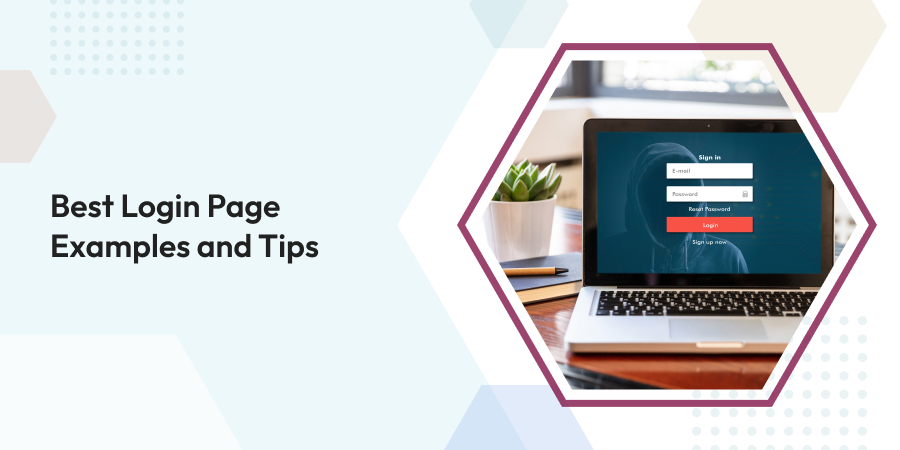
Best Login Page Examples and Tips
-
 Mar 31, 2023
 - UI UX Design
UX is not the only aspect in determining the effectiveness of websites and mobile apps. A login form may seem like a little part of the user experience, but it actually plays a significant role in most cases. Having a well-designed login page will increase the user engagement while also increasing the potential that a first-time guest will become a regular user. Having said that, a modern UI-UX development company like etatvasoft.com can help you in the process.
Customers today aren’t used to dealing with elaborate signup processes. In this fast-paced era, nobody has time to waste on filling out lengthy forms, particularly if they have to do so on a small smartphone screen.
Login page examples of websites and apps that require these forms include online commerce, social media networks, blogs, and the finest bank website designs. In an effort to keep their users around, several popular and heavily-visited websites have opted for a minimalist login interface.
1. Best Tips for Login Page and Examples
1.1 Accessibility is the Key
If you want people from all walks of life to be able to use your website, you need a welcoming login page. If it isn’t built with accessibility in mind, you’re shutting out a sizable demographic of people who rely on screen readers and other forms of specialized software.
Ensure that the login page, like all of the other pages, allows visitors to tab between items, has semantic HTML coding, has appropriately named form fields and buttons, has adequate color contrast, and loads successfully without JavaScript.
Maintaining online usability compliance is convenient if your page is already simple to use. The login page for both new and returning users should have an easy-to-understand layout with buttons like “forgot password” and “sign up,” as shown in the reference below.

1.2 Easy Registration Option with External Social External and Social Media Accounts
Signing up for a new app with existing google, Microsoft or social media one’s own social network account’s credentials is gaining traction. This saves the user the time and effort of registering from scratch, and allows them to immediately begin using the service. Users are more at ease using the app because they can join up with just one click using their existing social network or other external account.
Logging into an app using an already established account saves time and effort by eliminating the need to register for a new account and generate a new password for each usage. You can have a better idea from the below insight.

1.3 Separate Login and Sign-Up
There are two distinct user journeys, the login and the signup. Each user must just register once and then log in whenever they utilize the service. Only regulars need access to the login page. When a user visits your site for the first time, they should be able to go straight to the sign-up form without having to go through the login process.
It’s common practice to separate the login and signup processes into separate pages due to the differences in user flow between the two. You might, instead, have a single screen that serves as both a login and a signup. One of the best login page examples of separate login and signup indicated as below.

1.4 Clear Password Requirement
You should never assume that users are familiar with best practices for creating secure passwords. Passwords should preferably be shown close to the controlling mechanism.
When a user inputs an insecure password, show them the password policies regardless of the default setting. Users’ faith in your brand will suffer as a result of this, and they will also waste time fixing the issue. As mentioned in the image below, you can see it has mentioned password requirements clearly.

1.5 Unmask to View Password
It should be possible to show the password to the user if he requests it. If a user makes a typo when entering their password, they may easily fix it here. Be sure that password masking is turned on by default. Provide the user the option to reveal the password by means of a checkbox or toggle. Here is the one of the best login page examples from Google. Clicking on to show password will unmask your password as shown in the image, allowing you to quickly double-check it.

1.6 Use Email/Phone Number to Login
It’s a smart move to provide more than just the username and password login for the mobile app/website. Even if you require customers to choose an exceptional username and password upon registration it is important. It’s not uncommon for folks to forget their various login credentials.
Make signing in as simple as ABC by adding new login options such as an email address or phone number. Here we can see in below reference, it is providing that feature to login in directly with email.

1.7 Invalid Password Indication
Leaving the user to speculate as to why their password is incorrect is not a smart policy. Whenever a user enters an incorrect password, the error message should include a clear explanation of why it is incorrect along with clear instructions for fixing the problem.
Passwords that users repeatedly try to type incorrectly will quickly become a major source of frustration. Due to this, the user experience suffers. Check out the login page from Instagram.

1.8 Easy Password Recovery
Users frequently experience difficulties logging in by email and password because they cannot remember their password. A forgotten password should be recoverable through the login page’s interface. Therefore, provide a link to “Forgot Your Password?” on the login page, where it will be clearly seen by users.
This choice will guide customers easily through the procedure of regaining their password by providing a reset password link to one‘s associated email account or a specific code to their associated cell phone number. As shown in WordPress’s instance, email has been sent to user for easy recovering their password.

1.9 Warn Users When CAPS LOCK is On
Users may avoid using unnecessary capitalization if they are alerted that CAPS LOCK is enabled. You may place the alert next to the text box or within it. Warning users when their caps lock key on is important. It will save time by stopping users from typos, check out the below image from Quetext.

1.10 Remember Me Option
Users can more clearly communicate their desire for the site to save their logins by selecting the “Remember Me” feature. If they choose not to allow the site to remember their gmail account, which would make it easier for someone else to guess their passcodes, they can deselect the option.
You may accomplish this in two ways:
- If a user checks the box that asks them to “remember me” during registration, they won’t have to retype their email id the other time they sign in.
- After logging in, users have the option of having the system remember their email account. Instead of having to manually enter their email address each time, it will remember it for them.
Here in this instance from Moz, by simply clicking on the remember me button, the user’s details will be stored and one doesn’t need to add it again when he/she comes back.

1.11 Input Validation
You may improve the accessibility of your registration and login pages by implementing instant input validation. Users will be alerted to any problems with the form before they submit it. They may quickly and simply make any necessary adjustments thanks to the immediate feedback they receive after entering their data.
While delivering a practical immediate validation, there are a few key considerations to keep in mind. The user has just exited the input box, therefore only show the message then. A user’s confidence in your product might be bolstered by a helpful error message. In addition, the error message has to give a clear description of the issue and provide instructions for fixing it. Check out the image below from Surfer’s login page, it is showing an error message when someone enters invalid data.

2. Conclusion
This article addresses the best practices for developing a login page. Yet, you should constantly tailor your efforts to the demands of your specific audience and the objectives of your specific project.
The first time a consumer engages with your product might be during the signup and login process for a website or mobile app. It is essential to develop user-friendly sign-up and login interfaces to facilitate this process. The provided best practices here are easy to implement but will have a significant impact on your training process’s effectiveness.
Selecting the most appropriate technology may hasten the product's arrival on the market. It also provides the type of efficiency and customer engagement that modern...
Comments
Leave a message...